

What is your cover and front matter telling your reader?
I’m going to start each Novel Study analysis with a close look at the novel’s opening, so let’s see what the first few pages of N.K. Jemisin’s The City We Became has in store for us. For the first Novel Study post, on the opening of The Dutch House, I started with these questions:
What makes us want to keep reading?
How does the opening pull us into the world of the novel?
What do we know?
What’s implied?
What’s left as a mystery?
Let’s see what answers we get and find out whether there are other questions to be asked.
To start, what does the cover tell us? What do we think a book titled “The City We Became” will be about?
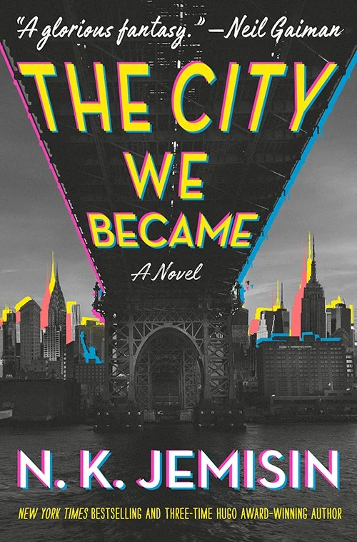
First, there’s the city, which the cover art tells us is New York. But it’s an off-kilter New York with an impossible collage of a view that makes it look as if the city’s iconic buildings and monuments (I spot the Chrysler Building, the Empire State Building, the Flatiron Building, and the Statue of Liberty) are massed on the East River around the Williamsburg Bridge, ready for an attack coming by way of Brooklyn. The title and some of the other graphic elements are given an electric, jittery color treatment that looks like a anaglyph. Something is slightly off, slightly on edge in this New York City, the cover tells us.
And what about the rest of the title? Who is “we” and how does this personified group become a city? The tense choice, “became,” is important too, signaling that the story is over and finished (the becoming is completed) but we are going to be told how it happened. The title is not “The City They Become” but the more dynamic, energetic, and inclusive “The City We Became.”
Let’s see how these initial impressions and questions develop as we start turning pages. First, we get an epigraph, a quote from Thomas Wolfe: “One belongs to New York instantly, one belongs to it as much in five minutes as in five years.”
Let’s take a moment to talk about the general purpose of an epigraph. How do they work and what should you consider when choosing one? The primary purpose of an epigraph is to cue the theme of a book. In this case, the epigraph builds on two elements of the title: it personifies New York City, casting it as a social entity like a family or a team, and it also includes the reader. You, the reader, are included in the “we” of the title, and you belong to New York, Wolfe tells us, even if you don’t know it yet.
A secondary function of an epigraph can be to signal that other authors have found your theme or topic to be worthy of study, and to signal that your book is part of that conversation in the larger world of ideas. Thomas Wolfe, author of Look Homeward, Angel and You Can’t Go Home Again, is known for writing about place, so Jemisin is joining that conversation.
Note that the epigraph is quite short. I think that’s the best choice for fiction: you don’t want readers to get bogged down in the rhythms and ideas of another writer before they get to your words.
Next up: a map! I do love a book with a map in the front. Right away it signals adventure, travel, new places. (You can use Amazon’s “Look Inside” feature to get a peek of it.) The writer wants to get us oriented in the geography of the novel, as well as give us a place to flip back to if we get lost.
What clues are we getting up front here before the story opens? The map is actually styled as a photograph of what looks like a simplified, 1950s-era map of the five boroughs, printed on heavy paper that has been neatly folded and reopened. The map itself reminds us how small Manhattan is in comparison to Brooklyn and Queens, and also how the other boroughs seem to share allegiance with other land masses, the Bronx being pulled north to upstate, Staten Island sidling over next to New Jersey.
Laid on top of the map is a business card for an entity called the “Better New York Foundation.” The card has a notation that the foundation is “a subsidiary of Tmw. Inc.” and the tagline “Prosperity and Progress,” the kind of bland corporate speak that makes you wonder what sin it is covering up. The business card overlaps a magnet or sticker shaped like one of the big old taxicabs that roamed mid-century New York and advertises a business called “Checker Cab Dream Weddings.” It includes a phone number too (the business card does not), which caught my eye immediately because it is standard copyediting advice not to include a real phone number, email address, website, etc in a novel unless you are prepared to create it in the real world. Well, guess what? Someone at Hachette has done just that. When you call 212-816-7469, you get a message that “City” is unavailable and urging you to try an “alternate contact method.” Ominous! Where is “City” and how else can I reach them?
Also pictured on top of the map is a pen, which has been used to make handwritten notes. There is a list of cities at the bottom with two, New Orleans and Port-au-Prince, crossed out. A note under Long Island reads “HERE THERE BE DRAGONS.” Studying the map more closely, we can see that the Williamsburg Bridge is crossed out and there are disturbing-looking tentacles emerging from various spots across the city and jellyfish-like creatures poised over others. What is happening in New York?
Primed with all of these clues and questions, we finally reach the prologue. There is a lot to be said about prologues in general and how they work, and about this prologue in particular, so we’ll get into that in our next post.
In the meantime, notice just how much information you can convey about your book before the reader encounters the first words of the story. Ask yourself these questions about your own manuscript:
What does my title signal about the themes or subject matter of the novel? What kinds of words am I using? If my title consists of just nouns, what would happen if I included a verb, a pronoun, an adjective?
What kind of visual feel would you want your cover to convey? What kinds of images resonate with your themes and subject matter? Investigating this question might help you clarify your themes and will also give you a head start when it is time to think about the cover for real.
If your novel had an epigraph, what would it be? What themes, topics, conversations is your book part of?
If you drew a map of the world of your novel, what would it include? What hints would you want to drop readers before the book began? This exercise might also open up new possibilities if you are still drafting. Are there areas on this map still to explore in your novel? Or are there new contrasts or connections you can see through this visual representation of your story world?